Single Screen Workflow

April 7th, 2010

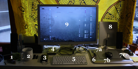
This is my workspace:

Workspace

  • 1. Swiss army knife (be prepared)
  • 2. Coffee (be awake)
  • 3. iPhone
  • 4. Hard drive (with emergency operating system and repair kit)
  • 5. Tiny wireless keyboard
  • 6. Laser pointer (to entertain cats without getting up)
  • 7a. Pen pad (for graphic design)
  • 7b. Normal mouse (for COD4, honestly)
  • 7c. Magic Mouse (for everything else)
  • 8. Macbook Air (probably shouldn’t be leaning against a window, but what the hell)
  • 9. Monitor (it is true that once you have a setup similar to this, Apple sends you a free black turtleneck)

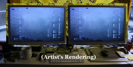
Aside from the unusual number of mice, many of my programmer friends are curious as to why my setup doesn’t look more like this:

Dual Screen

… especially since I have extra monitors around. I used to have another one hooked up. But three months ago I removed the extra monitor at both my home and work, much to the dismay of my coworkers. After almost ten years at various media jobs, with between two and four monitors, I know only use one by choice, and the rest of this essay is about why.

First, since Apple stole Spaces from linux, I use four desktops, down from the nine I used back when it was the newest toy. Here’s the graphic display:

Spaces

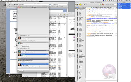
Roughly I divide this into the communications, research, facebook, and xkcd screen:

Communications Screen

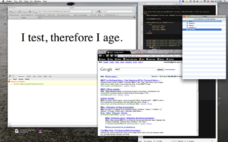
Followed by the predominant workload screen:

Which houses a Textmate project for large projects with numerous files. Textmate is still my favorite editor for HTML and CSS. More on Texmate later. Firefox and Firebug are still the de facto standard for first round CSS an Javascript debugging, so that’s where the testing goes on, and I keep Chrome open for looking up the 1001 ways CS still tries to screw you. I prefer to keep the Firefox environment free of potentially memory draining or Firebug confusing influences, and I also find it generally easier to switch between applications than tabs when switching from testing to looking things up. Also a Finder window or two for random file browsing.

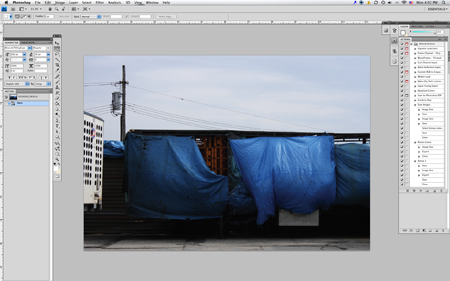
Next up, design:

Design Window

This is pretty much just Photoshop (I know I shouldn’t have to link to this, but I already linked to Firefox, so I’m just going with it), though I occasionally keep Bridge open if I’m working with more than six or seven images. At home, this is no problem, as my tower is on steroids. At work, the memory strain makes Bridge untenable, so I just keep a Finder window handy.

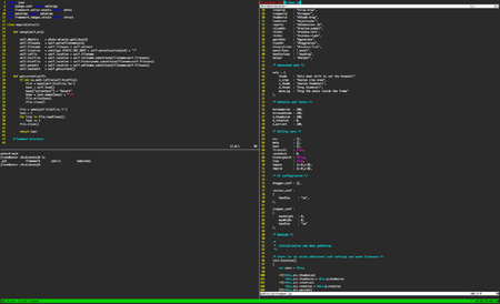
Lastly, Terminal:

Terminal Screen

I use Terminal for all the monitoring and sysadmin sorts of things for which you need Terminal, and I use Vim in Terminal for surgical frontend work and most non-frontend programming: Python, PHP, Bash, etc.

So. A lot of stuff going on. Why wouldn’t I have an ectra monitor?

In video editing, you need screen real estate. You’re often tweaking settings in a massively complex program, monitoring color charts, and watching realtime effects in an HD monitor. For most actions, there are global effects going on that require sensitive experimentation while keeping track of several representations of the results.

This is basically never true in coding. You make discrete logical changes, then execute a test or reload a browser. The fundamental workflow operation in coding is isolation, and getting to a usually simple problem as quickly as possible. So the most valuable asset to coding is rapid navigation amidst the million lines of code.

Navigating around the various programs I have open is not a problem. From the top down: Spaces, which lets me divide types of work. To access any particular program, I have both the Command + Tab combination, which I use most going between Firefox and Textmate, and Quicksilver:

If you own a Mac and don’t have this, go get it. It makes the dock pretty much obsolete, and is better than Command + Tab navigation in that it will launch a new window if you don’t have one open.

So I can navigate to any program, and to any workflow setup with, at most, five keystrokes.

In Terminal, I generally have at least three tabs open. Within each Terminal tab, I’m running tmux, and each instance of tmux has at least two or three full screens going, each of which is broken into two to four sections. Like as not, at least one of those is running Vim, for which I have a mini-buffer:

… which provides quick access to anything in the Vim buffer.

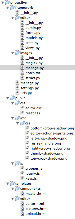
Back in Texmate, there’s a project drawer:

Project Drawer

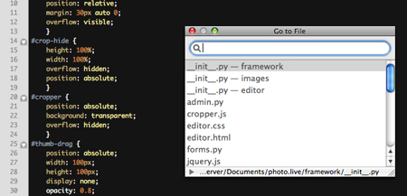
… but I rarely open this, because of the Go To File command, which opens this interface:

… which is usually faster than scanning down the file list, once I have a passing familiarity with the filenames.

Adobe finally caught on to Command + ~ to switch between windows in Photoshop, so getting around a handful of PSD’s is no problem, and if it’s more than that, swapping to Bridge is no more than four, and usually just two keystrokes away.

These are my workhorse programs, but all of my programs have fairly simple key combinations to navigate around them. Back before I knew these combinations, I was married to my mouse, and the most important thing was to have each program visually accessible, because the primary path to any particular program or piece of information was the visual point and click path.

Now I have my keyboard:

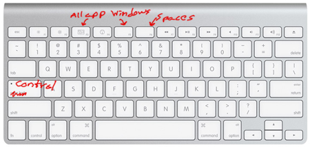
Keyboard

Since I NEVER use caps lock, mostly because I don’t get involved in screaming forum wars, I changed it to another Control key, since I use it all the time in Terminal and Textmate, and the regular Control key on this keyboard would long ago have transformed my pinky into a painfully curved claw. The F6 key is spaces if I do find myself wanting visual navigation, and I have two All Applications buttons for the same reason. Why two? I forgot about the built-in one, and I haven’t found another use for the blank F5 yet.

So with my tiny tricked out keyboard and a reasonably thorough, but by no means exhaustive, knowledge of keyboard shortcuts, my access is semantic, which is a far better way to navigate code. All my primary means of navigation are either abstracted and id-based (Control + [1-4] switches my workspaces) straight searching (/whatever in Vim) or text-guessing (PH gets me to Photoshop in Quicksilver). Getting to any part of my workflow, which constitutes thousands of files of a dozen types with half a dozen interpretative interfaces, is only a matter of a dozen keystrokes, which I can achieve in under six seconds.

This kind of precision navigation is the most useful skill I cultivate, and extra visual real estate is just distracting. Looking at two screens and finding things visually among a dozen open programs is less efficient than keystroking (pun avoided) my way to the issue at hand. I say this as a programmer, but also as a person predominantly trained in the visual arts. Personally, graphic recognition is my strongest trait in all the stupid IQ tests available to the bored computer worker. I still think it’s more efficient to have a single visual portal and a strong grasp of semantic navigation than it is to have a crowded visual landscape.

A common saying in any information based job is “too much information is the same as too little.” Certain kinds of work require certain amounts of immediately available information. My job, at any point, requires one, distinct piece of information. Isolating a handful of bytes form the billion or so is a skill of making semantic and logical connections. Once you’ve mapped navigation to a few keystrokes, the navigation part of investigating the information becomes a matter of muscle memory. When on a semantic (I know that word’s been popping up a lot; bear with me, it’s almost over) or logical train of thought, I don’t have to readjust to sorting out a visual map unless I want or need to. I usually only have one program in front of me, so I’m less easily distracted, and I get better at getting to the one program I need. Better still, I don’t have my head at a weird angle for half the day.
Polygon Boundary

March 25th, 2010

One of the many fun things about being in charge of advertising implementations is your boss will say things like, “Hey, I need you to do the design and markup for this ad and only show it to users living in a polygonal region of California. Can you get that up in a couple of hours?”
Read the rest of this entry »

Key Binder

March 24th, 2010

So I was playing around with keyboard interface possibilities a couple of years ago, and eventually got the go ahead at OkCupid to implement keyboard shortcuts for navigating the site. The condition was it had to be minimally invasive and not eat up overhead tracking keystrokes. I also wanted to be able to track modifier keys sensibly, and have a simple interface for setting shortcuts.

kbind’s sole purpose is to track key strokes and keep an internal representation. To add a keyboard shortcut, you just write:

kbind["CTRL+A"] = function () {
    alert("Hiya");
};

… and it adds it to the kbind object as a method. You can also add stacked combinations, like

kbind["CTRL+ABIDE"] = function () {
    alert("Yeah, well, you know, that's\ 
             just, like, your opinion, man");
};

… which I programmed largely so I could put easter eggs in the okcupid interface (never got around to it). It also includes a built in toggle mechanism, which you can set like this:

kbind["T"] = {
	toggle : {
		toggleState: false,
		on:function() {
			alert("I'm on!");
		},
		off:function() {
			alert("I'm off!");
		}
	}
}

Finally, you can switch it on and off with kbind.enable() and kbind.disable().

The code is below, do as you please with it. This one’s based on the jQuery library; you can find the original, Prototype.js version at OkCupid.

/*

kbind.js

	- because I hate reaching for my mouse

Quietly keeps track of key combinations and allows interface
for event binding.

*/

var kbind = {

	ctrl		: false,
	shift		: false,
	opt			: false,
	stack		: "",
	clamp		: false,
	extant		: false,
	hardclear	: false,
    
    translations:{
        //Enter
        _13:"ENTER",
        
        //Numpad
        _96:"0",
        _97:"1",
        _98:"2",
        _99:"3",
        _100:"4",
        _101:"5",
        _102:"6",
        _103:"7",
        _104:"8",
        _105:"9",
        _107:"+",_61:"+",_187:"+", //unify keys
        _109:"-",_189:"-"
    },

    init:function(hardclear) {
        
		this.hardclear = (hardclear?true:false);

		if(this.extant) return;
		
		this.extant = true;
		
		var pass = this;

		$(window).bind(
			"keyup",
			function(e) {
	   			if(pass.clamp) return;
	
				// Unlink modifier keys
	            if(e.keyCode == 17) {
					pass.ctrl = false;
					pass.stack = "";
				}
	            else if(e.keyCode == 16) {
					pass.shift  = false;
					pass.stack = "";
				}
	            else if(e.keyCode == 18) {
					pass.opt = false;
					pass.stack = "";
				}
	            else if(pass.hardclear) {
					pass.stack  = "";
				}
	            pass.state();
	            return;
        	}
		);
		$(window).bind(
			"keydown",
			function(e) {
				if(pass.clamp) return;
				
				// Add modifier keys
	            if(e.keyCode == 17) 
					pass.ctrl = true;
	            else if(e.keyCode == 16) 
					pass.shift  = true;
	            else if(e.keyCode == 18) 
					pass.opt    = true;
	            else {
					// Translate and add to the stack
	                if(pass.translations["_" + e.keyCode])
	                    pass.stack += pass.translations["_" + e.keyCode];                    
					else
	    	            pass.stack += String.fromCharCode(e.keyCode).toUpperCase();
	            }
	            pass.state();
	            return;
        	}
		);
		// This addition prevents the ctrl key from
		// getting stuck on ctrl+click
		$(window).bind(
			"mousedown",
			function(e) {
				if(pass.clamp) return;
				
				pass.ctrl = false;
				pass.state();
			}
		);
    },

	disable:function() {
		this.clamp = true;
	},
	
	enable:function() {
		this.clamp = false;
	},
	
    state:function() {

        if(this.ctrl)   ctr_text = "CTRL+";
        else            ctr_text = "";
        
        if(this.shift)  sft_text = "SHIFT+";
        else            sft_text = "";

        if(this.opt)    opt_text = "OPT+";
        else            opt_text = "";

        if(this.stack)  act_text = this.stack;
        else            act_text = "";

        pressed = ctr_text + sft_text + opt_text + act_text;

        if(this[pressed]) {
			if(this[pressed].toggle) {
				if(!this[pressed].toggleState)
				{
					this[pressed].toggleState = true;
					this[pressed].toggle.on();
				} else {
					this[pressed].toggleState = false;
					this[pressed].toggle.off();
				}
			} else {
				this[pressed]();
			}
			this.stack = "";
		}
    }
};
kbind.init();

Problems with Design Testing

March 22nd, 2010

My work at OkCupid gave me the so far unique opportunity to help design some research and development methodologies with an enormous user base. Some of my favorite work came from when I and the rest of the frontend team were tasked with improving signup conversions rates, which is the endless obsession of any website with membership. OkCupid had been poking at it for years, but this was the first time we dedicated the whole team exclusively to optimizing signups.

The process is what I imagine any other audience testing process is; research, research, research, put out a few designs, measure the conversion rates of each, take the best performing, theorize as to why it outperformed the others, repeat.

My ending design won that particular round (woot!), but I encountered an interesting problem. My own theories for signup seemed to pan out:

  • Keep each section short, which was key to the okcupid signup since we require eight pieces of information at the outset, and eight items plus captcha on one page can be a bit intimidating.
  • Order the items from simple and general to difficult and personal. I started with gender and orientation, and ended with username, password, email and captcha. The idea is to get people invested in the process with simple questions, so they’re already committed to finishing the form by the time they get to questions where they have to think (username) or cough up info they might be wary about (email).
  • Give them a taste of the site as they go through it. My particular design was nicknamed “adaptive” because once it had gender and orientation, it immediately found user profiles and displayed them alongside the signup form. Once it got to the “what are you looking for?” field, if the user only checked non-dating options (pen pals, friends, activity partners), it would stop promoting user profiles and start promoting the tests, forums, and other time-killers and social features of the site.
  • Keep it light. OkCupid allowed for a healthy sense of humor, and the signup process reflected that. If a person has begun the signup process, they appreciate some tenor in the site’s personality, and the signup process should continue to reflect that. I have a strong negative reaction to sites that have a particular feel, then skimp when they have to put together complex forms. This is deadly to a signup process.

So that all sounded valid, and seemed to pay off. Once the adaptive design started outperforming other trials, I got interested in tweaking it. As any good scientist would in comparing data, I had to start isolating elements: change the wording for a particular question, put three questions on the opening page instead of two, show two matches, three matches, keep promoting users even if the people say they don’t want to date, etc.

I made various tweaks in this vein, but eventually, we were running over a hundred trials, and starting to compete for dwindling segments of daily signups with which to test. With thousands of users to work with, you can make statistical comparisons in a day; with a few dozen, it takes a week, and we just had to move on.

There’s a problem with this kind of testing, which is you’re not testing what my statistics enthusiast friend calls interaction effects. Briefly, the problem is this:

I test three color themes: red, blue, yellow. Red gets the most signups, so I go with a red theme. Then I test three variations on question text: humorless, witty, and absurd. Witty does best. Now I have a witty red theme, and go on to test something else.

What I don’t know is if a humorless green theme would have done better. I don’t even know if witty blue theme would have done better. Basically, I can’t determine if I’m pursuing the best combination because I’m not testing all possible combinations. With three colors and three writing styles, I could easily test the nine possible combinations, but it’s never three and three in real life design scenarios; it’s thousands and thousands and thousands and thousands, and the number of combinations rapidly starts competing with those awesomely huge numbers, like particles in the universe and connections in the brain, people use to express “a whole bunch”. Not even Google in a million years could test it all.

There’s no way around this problem except to try and extrapolate theories from the tests and come up with new hypothesis. This is basic science. With the vast sample groups popular internet sites have to work with today, testing interface and aesthetic design has become more and more of a numbers game, since you can isolate any particular variable and find out what value performs best within the hour. But this method must be balanced with theoretical and more radically experimental approaches, because there’s no way to test the entirety of the staggeringly large set of possible combinations.

Hello world. Hello world indeed.

February 15th, 2010

So this is a brand new website.  My former professional website will shortly be entombed, its singular name released back into the wild, its contents set on fire and nudged out to sea.

Why?

Well, Jim, there are a number of reasons.  My former website was invertible.net.  I thought it was quite clever to snap up that simple, one word domain, even if .com was taken, and I got it essentially because nobody knows how to spell it.  Unfortunately, nobody knows how to spell it, so the memorability of a one word domain name is lost if everybody is looking for invertable.net.  Also, I was tired of being corrected when I was right.  A more argumentative soul may have relished proving people wrong on a common misconception; such pleasures have long been lost on me.

A better reason is I’m changing my professional name to Hunt Welch, Hunt being my middle name.  I’ve considered this for a while, because there’s a congressman named Peter Welch, and as a low-key, problem-solving oriented software engineer who’s not famous for anything, I will never beat him out for that first page of google results.  After the congressman, there are 240 Peter Welch’s on Facebook, so I’m bowing out.  They can have it.  As far as I know, nobody is named Hunt Welch, so I have an edge.  Also, it’s cool.

An even better reason than that is I made my old website by hand years ago, when I knew basically nothing and was teaching myself php with w3schools.  When it breaks and I have to look at the code and fix it, I can’t help but think, “I wouldn’t hire me.  Jesus, who wrote this?”  The effort of resuscitating a code base that’s begging for death became less practical than starting over, and the difficulty in updating the simplest elements is part of the reason the last entry was made three years ago, and the portfolio pieces make me cringe on a regular basis.  The other reason is of course that I’ve been working office jobs non-stop for three years, so my look-for-work website was low on my list of things to do.

Finally, everybody’s looking for WordPress people, so I figured it was about time to install it and start learning it.  I’ve long resisted these kinds of prepackaged CMS systems, because I’m a self-taught programmer.  I didn’t go to school for it, didn’t know what was out there, and it started as a hobby, and in a hobby, you’re not worried about how long it takes.  You want to reinvent the wheel, and call your old math professors with obscure trigonometry problems so you can program a 3D interface that’s already been done by countless people who did it better than you ever will.  I got into this life via curiosity; now that it pays my bills, I need to be more efficient about things.

So.  My name is Hunt.  This is my WordPress blog.  Hello world.